How a visual identity is born – from a mark for an artist to four characters of a single candle brand
Text: Svitlana Bielova, co-founder and designer of MitU, USB’s marketing hub
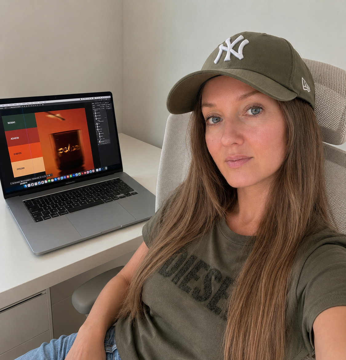
To me, design isn’t decoration — it’s a communication tool. It helps a business be recognisable and inspire trust even before the first word is spoken. I create visual systems that reflect a brand’s character and help it speak to its audience in one shared language. That’s exactly what I do at MitU — USB’s marketing hub in Bern, where I’m responsible for branding and visual identity.
Twenty years in the profession – and a new beginning
I’ve been working in design for over twenty years. I studied journalism at Mechnikov National University in Odesa, where I was already learning typography, layout and publication design, and later studied computer graphics at an IT academy. That combination of text and image shaped my path. I went through every stage of the profession: from junior designer at an advertising agency to art director of a design studio, and later spent many years working as a brand and packaging designer for international companies — from coffee brands and pharmaceutical companies to FMCG and Amazon. Logos, corporate identities, labels, packaging, brand books — that’s my everyday language.
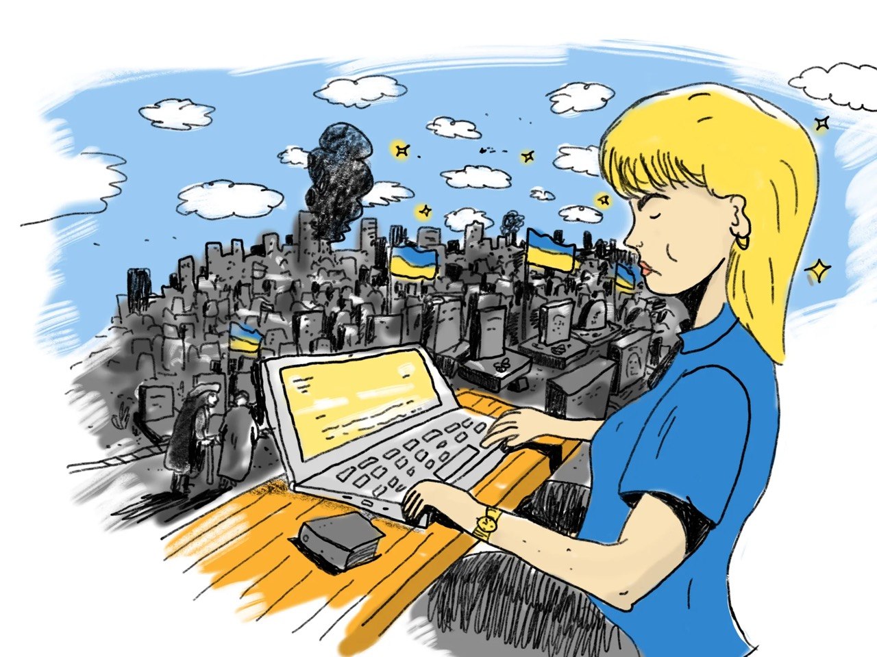
The war forced me to start over in Switzerland. And it was precisely the experience of relocating that showed me, from an unexpected angle, something I already knew as a professional: without a clear visual identity, you go unnoticed among countless other offers. When you’re new in a new market — without a style, without a visual story — you’re invisible.
That’s when I understood: it’s not enough to design just the brand. You also need to design the specialist, the master of her craft, standing behind it — to give her her own style, image and individuality. Without that, it’s harder to make yourself and your skills known, to feel confident, and to present yourself to the world.
In USB’s programme on civic engagement and social entrepreneurship, I met marketing strategist Mariia Baldina and UX/UI designer Liubov Kulyk. That’s how MitU was born — a hub where strategy, design and digital experience work as a single system. My area is everything a brand “wears”: logo and mark, colours, typefaces, packaging, print materials, patterns and design systems.
A mark for an artist: Olha Sabadin’s identity
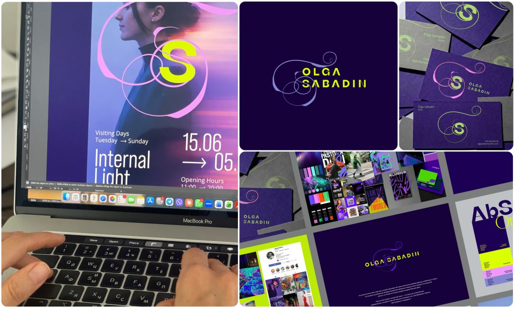
One of my favourite projects at the hub is the visual identity for Ukrainian artist Olha Sabadin. Olha paints vivid, fluorescent canvases — mountains, flowers, light glowing in the dark. My task was to create a mark that wouldn’t compete with her painting, but continue it.
The logo is built around a pattern-mark that exists as an independent, recognisable unit, apart from her name. It’s constructed as a visual metaphor for inner movement: flowing lines reflect the stream of thoughts, feelings and states from which an artistic image is born. The pattern doesn’t illustrate anything literally — it’s open to interpretation: some see a path in it, others transformation or energy, the connection between the visible and the invisible.
I drew the palette from Olha’s own paintings: deep blue-violet, neon yellow, pink and lilac — the colours of her night landscapes and fluorescent flowers. For the typeface, I chose KyivType Sans — a modern Ukrainian typeface: a small typographic bridge between home and a new stage. The mark lives on business cards, exhibition posters and social media — everywhere Olha presents her art.
Four characters of one brand: Palae
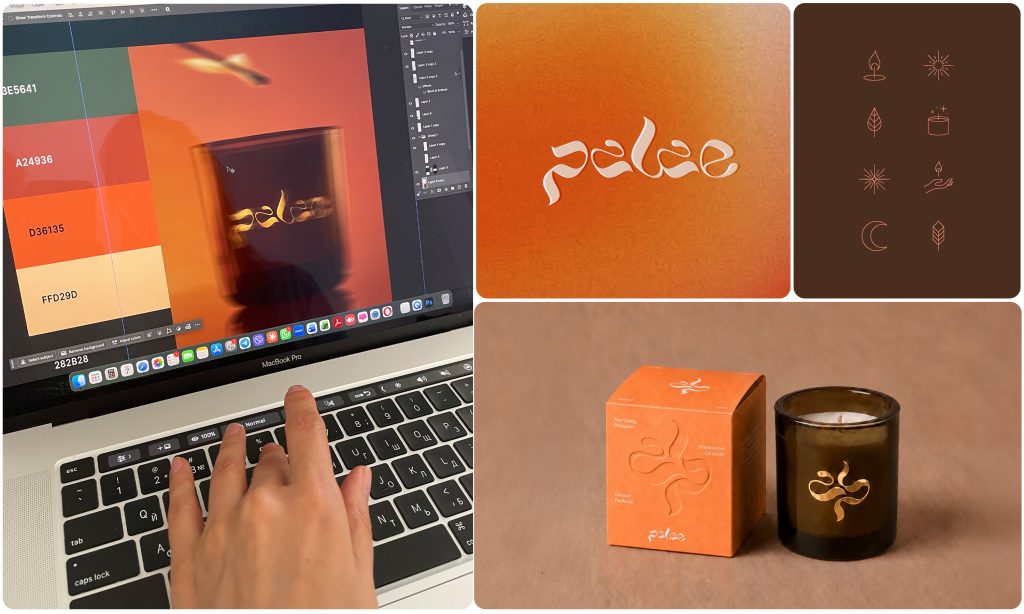
A completely different task was the brand Palae, Aliona’s handmade candles and creative workshops. Here I worked using the method I consider the most honest in branding: not to impose a solution, but to show the founder different characters of her own brand — and let her choose the one in which she recognises herself.
I developed four full concepts, each with its own logo, mark, palette and mood: “Living Fire” — warm gradients and a handwritten logo for a brand that wants to be remembered; “Earth and Smoke” — a deep, dark palette of terracotta and forest green, a calligraphic mark, the tactility of kraft and embossed paper; “Quiet Luxury” — a classic monogram, timeless and trend-proof; and “Organic Modern” — clarity, pastel lines and an infinity symbol, where each scent gets its own colour. Four paths — and each one honest to the product.
Alongside the concepts, I analysed the existing brand identity, prepared flyer layouts for digital and print, label templates for packaging, and dedicated graphic elements — everything that helps the workshops look professional at every touchpoint, from Instagram to a market stall.
Craft plus new tools
A classical design education gave me not just a sense of form, but also a solid technical foundation and a deep understanding of production processes. Years of working with print houses taught me to account for how colour behaves on different types of paper, how to prepare a layout for print, anticipate possible risks, and avoid mistakes whose cost is often measured in print runs. This foundation also includes knowledge of typography, composition, logo construction and working with grid systems.
Today, young designers increasingly try to delegate part of these processes to artificial intelligence, but without a professional foundation, that doesn’t always produce a high-quality, viable result. To me, artificial intelligence is above all a tool and an assistant. It helps research the market and target audience faster, visualise concepts, test directions, and in some cases reduce the cost of complex photoshoots.
But technology can’t replace my core work, professional judgement and responsibility for the result. I always make the final decisions myself, drawing on experience, visual culture, production knowledge and an understanding of the brand’s character. That ability to combine idea, aesthetics and practical execution is, for now, still beyond the reach of artificial intelligence.
Why I do this
In every MitU project, I see more than just a technical task. Behind every brand is a journey and a person. Behind the artist’s brand is a woman rebuilding her creative career in a new country. Behind the workshops’ brand is a founder turning her passion into a sustainable business. I know the price of that journey, because I’ve walked it myself.
Good design doesn’t just sell a product. It gives a person the confidence to show themselves to the world — and to be recognised. That’s the moment I work for.